In order to plot chart type information in the Animator, a number of custom
images have been created. These images are SVG files with embedded code.
Currently, these images and their file names are:
These images can be imported into an existing SVG image, resized and
relocated as needed. The custom images themselves are SVG files using the
D3 library to create the charts. Each image has a range of attribute
values that can be set in the Animator or using the Inovista API to change
values at runtime. The attributes include the data values, horizontal or
vertical orientation and various decorative options.
Once loaded into the Animator, transitions on the custom images can be
created in exactly the same way as for any other image. For example, they
can be moved, scaled or rotated.
Adding a Custom Image to an SVG Image
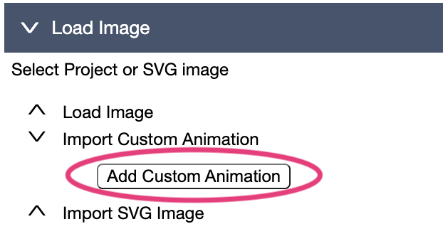
There a two ways to import a custom image into an Animator project. In the
Animator 'Load Image' section, there is the 'Add Custom Animation' option.
Alternatively, a custom image can be imported into the image in an SVG
editor and then loaded into the Animator.
1)Using The Shared Images Popup
A number of shared custom images are available online. To access these
images, locate the 'Add Custom Animation' button in the 'Load Image' section
and click the button.
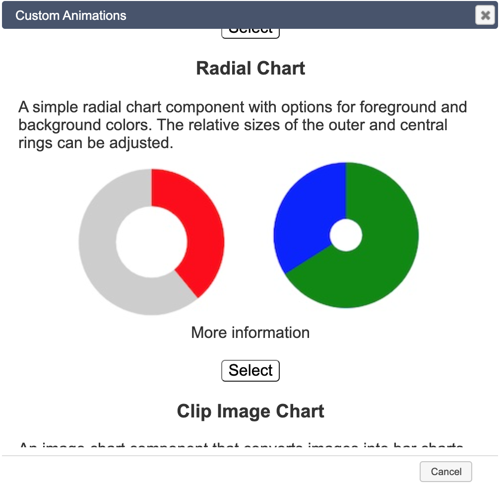
This should present a dialog of available Custom Animations in a list.
Scroll through the list until the required image is found, then click the
'select' button below that image. This will import the image into the
current Animator project.
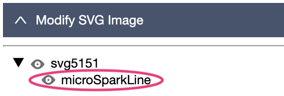
The loaded animation will be placed in the element tree. There will be only
a single element representing the animation. The variables used to run the
image will be available once a transition has been created.
Use 'Modify SVG Image' to resize and relocate it. See Modify
SVG Elements
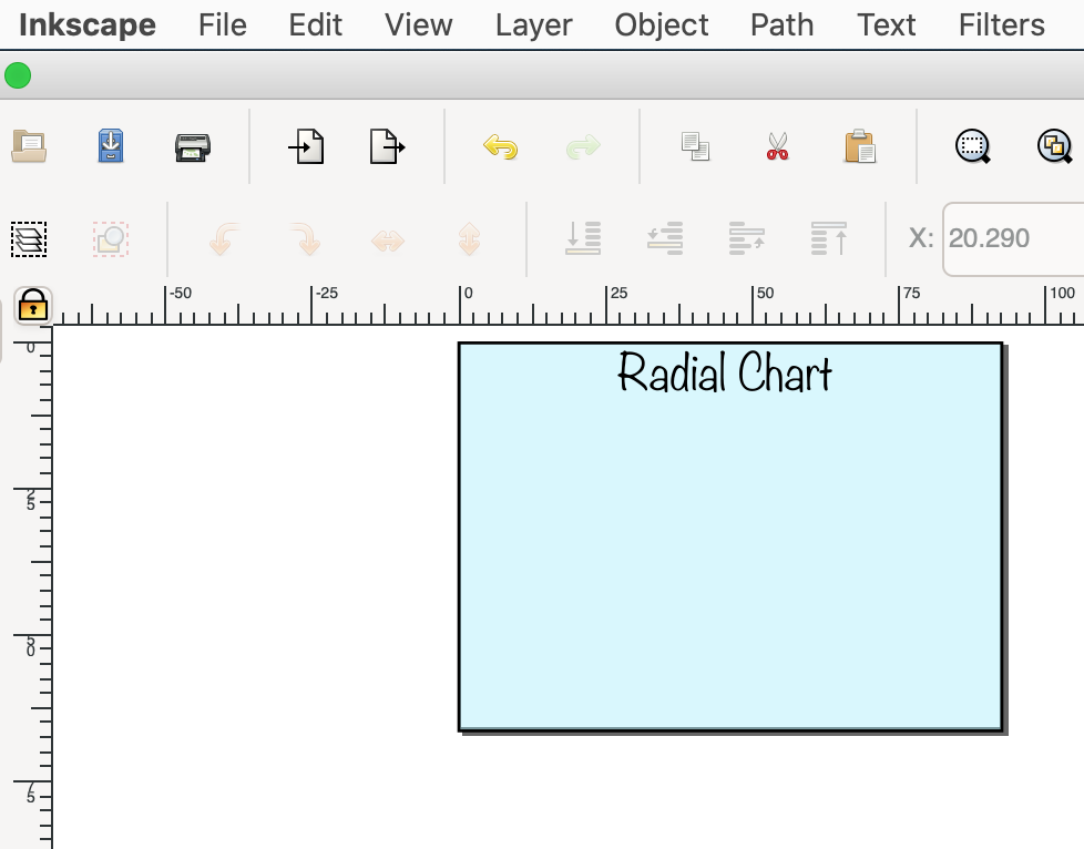
2)Using an SVG Editor
Using an SVG editor, a custom image can be imported into an SVG Image as an
element. The element can then be relocated and resized like an other element
in the image. The samples below are using Inkscape
which is an open source SVG editor, however most editors offer similar
capabilities.
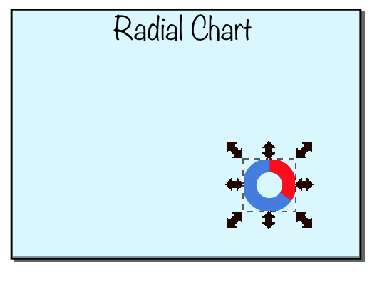
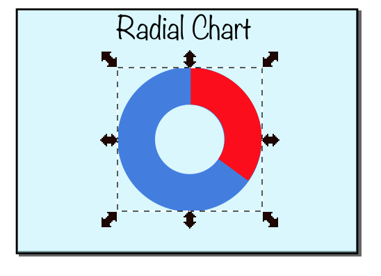
1) Open Image in Editor
2) Import Custom Image
3) Image Imported
4) Resize and Relocate Image
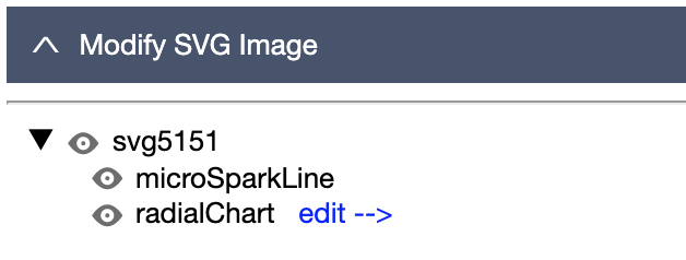
Using the Image in the Animator
Once the image has been successfully created and saved, it can be opened in
the Inovista Animator. The Custom Element will be listed in the Element Tree
as a parent type element with no children. In this case of the above
example, it will be named 'radialChart' or whatever Id it was given in the
SVG editor.
1) Open Image in
Animator
Once the edited custom image has been
loaded into the Animator, select the imported custom image in the
Element Tree and click on the 'edit -->' option.
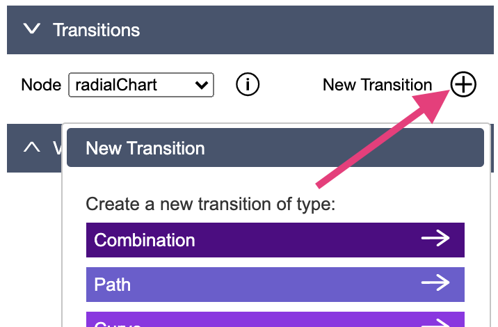
2) Add a Transition
In the 'Transition' section, select the 'New Transition' button and
then select the desired transition. Note that for the chart to
populate, it must have a transition even if the transition performs no
activity i.e. a blank transition.
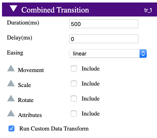
3) Populate Chart
As many chained transitions as required can
be added (or none at all), however, the chart will be populated by
data for each transition where the 'Run Custom Data Transform'
checkbox is selected.
4) Custom Image
Variables
Custom images have a predefined set of
variables that are used to populate the data and set various
properties such as color and format. The values set in the Animator
will be the defaults when the images is loaded, however, these
variables can be set and updated at runtime.
Custom Radial Chart
The Radial Chart provides a bar chart like visual but animated in a
circular motion.
The outer and inner radii which define the circle can be adjusted as can
the colors of the foreground and background.
Custom Radial Chart
This example uses the 'Radial Chart' custom image. The chart has a
semi scale type initial transition which scales the x axis from '0.05'
to '0.9'. This gives a slight spin impression. The '0.9' is due to the
initial scaling of the custom chart and represents its full size in
this image.
The 'Run Custom Data Transform' option is checked in the second
chained transition,
The text value is updated has a fade in, in addition to a Dash Array
effect.
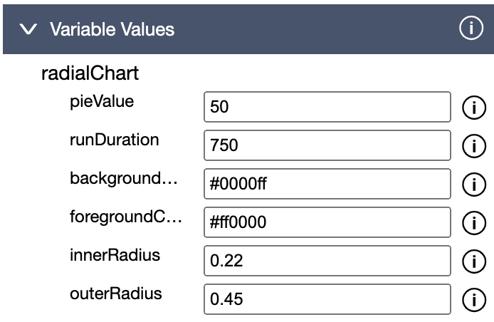
The settings in the Variables section of the Animator are as
below. The value of the chart is set by the 'pieValue' variable.
Radial Chart Variables
pieValue: The percentage of the outer ring the inner
ring will rotate. A value of '0' will mean no rotation and a value
of '100' will mean a complete rotation.
runDuration: The amount of time in milliseconds to
rotate the chart.
backgroundColor: The color in hex of the part of the
radial chart that rotates, i.e. '#008800'
foregroundColor: The color in hex of the base of the
radial chart, i.e. '#ff0000'.
innerRadius: The proportional size of the inner
radius of the chart. A value of '0' will mean there is no space.
Larger numbers such as 0.3 and 0.4 will take a larger proportion
of the whole chart.
outerRadius: The proportional size of the outer
radius of the chart. 0.5 will take the full area given to the
chart.
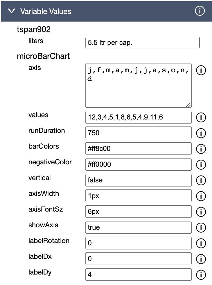
Custom Bar Chart
The Custom Bar Chart provides a standard single bar series plot that
can also be used as a 'Micro Bar Chart'. There are options for
vertical/horizontal viewing, bar colors, axis visibility and label
rotation.
Custom Bar Chart
This example uses the 'Custom Bar Chart' image. No additional
transitions are run on the bar chart and so the only option used in
the single transition is that the 'Run Custom Data Transform' option
is checked. There is also a 'Clip' transition used on the wine part of
the glass and a text update on the TSPAN element.
The settings in the Variables section of the Animator are as
below. The chart values are updated with the 'values' property and the
text is updated from the 'liters' property.
Bar Chart Variables
axis: Enter values to be used on the axis. Separate
each value with a comma.
Note that if the 'showAxis' property is 'false', the axis will not
be visible.
values: Enter values to be plotted in the chart.
Separate each value with a comma.
runDuration: The amount of time in milliseconds to
display the chart.
barColors: A list of colors in hex format for each bar
i.e. '#ff0000, #00ff00'. Separate each value with a comma.
Note that if only one color is used, all the bars will use that
color.
negativeColor: The color of the negative values in the
chart in hex format, i.e. '#ff0000'
vertical: Use 'true' to make the component plot
vertically and 'false' to make it plot horizontally.
The options are:
labelRotation The rotation of the axis labels. Note
that they can be negative, i.e. '-45'
labelDx: Move the axis label this many pixels to the
left or right, i.e. 2
labelDy: Move the axis label this many pixels up or
down, i.e. 2
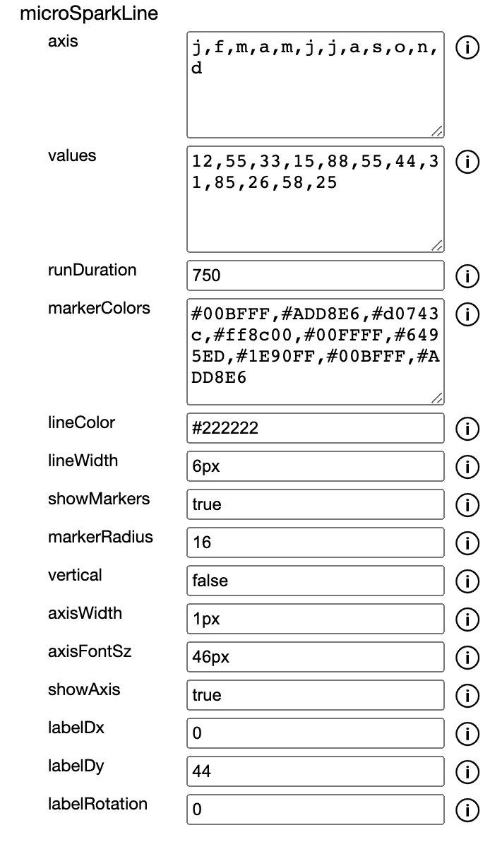
Custom Spark Line Chart
The Custom Spark Line Chart provides a standard single line series
plot. There are options for vertical/horizontal viewing, data point
markers, line and marker colors, axis visibility and label rotation.
Spark Chart
In the Transaction section of the Animator for the Spark Chart,the
settings are as follows:
Spark Chart Variables
axis: Enter values to be used on the axis. Separate
each value with a comma.
Note that if the 'showAxis' property is 'false', the axis will not
be visible.
values: Enter values to be plotted in the chart.
Separate each value with a comma.
runDuration: The amount of time in milliseconds to
display the chart.
markerColors: A list of colors in hex format for each
marker i.e. '#ff0000, #00ff00'. Separate each value with a comma.
Note that if only one color is used, all the markers will use that
color.
lineColor: The color of the the chart line in hex format,
i.e. '#ff0000'
lineWidth: The thickness of the the chart line in pixels,
i.e. '2'
showMarkers: Use 'true' to show data point markers on the
chart line and 'false' hide them.
The options are:
labelDx: Move the axis label this many pixels to the
left or right, i.e. 2
labelDy: Move the axis label this many pixels up or
down, i.e. 2
labelRotation The rotation of the axis labels. Note
that they can be negative, i.e. '-45'
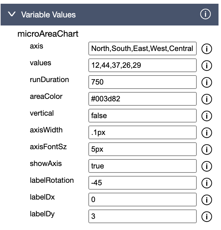
Custom Area Chart
The Custom Area Chart provides a standard single area series plot that
can also be used as a 'Micro Area Chart'. There are options for
vertical/horizontal viewing, area color, axis visibility and label
rotation.
Area Chart
In the Transaction section of the Animator for the Area Chart,the
settings are as follows:
Area Chart Variables
axis: Enter values to be used on the axis. Separate
each value with a comma.
Note that if the 'showAxis' property is 'false', the axis will not
be visible.
values: Enter values to be plotted in the chart.
Separate each value with a comma.
runDuration: The amount of time in milliseconds to
display the chart.
areaColor: The color of the Area Chart in Hex i.e.
'#ff0000.
vertical: Use 'true' to make the component plot
vertically and 'false' to make it plot horizontally.
The options are:
labelRotation The rotation of the axis labels. Note
that they can be negative, i.e. '-45'
labelDx: Move the axis label this many pixels to the
left or right, i.e. 2
labelDy: Move the axis label this many pixels up or
down, i.e. 2
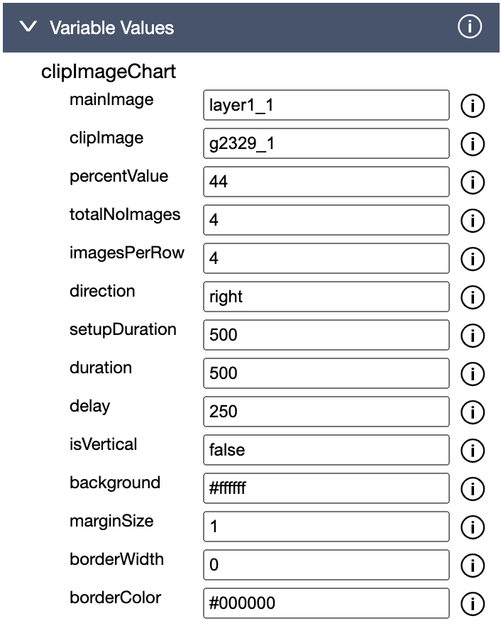
Clip Image Chart
The Clip Image Chart allows a designer to use an SVG image to create
bar chart style plots with the images optionally using a background for
each image. The charts may contain multiple rows or columns of images and
may plot vertically or horizontally and image layouts can be adjusted by
editing the number of items in a row or column.
Multi-Row Clip Images
This example shows a couple of 'Clip Image' charts. They both simulate
bar charts by painting a clearer image over a background. In this case,
the bar extends over several rows. The apples are plotted horizontally
and the bananas vertically.
Clip Image Chart
This example shows a simple single row 'Clip Image' charts. The cars are
plotted horizontally and populates from left to right.
Variables in Animator
Clip Image Variables
mainImage: Enter the id of the main svg element that
is to be plotted.
The element can contain other elements including elements that can
be used as a background.
clipImage: Enter the id of the part of the svg
element that is to be clipped.
This may be the same value as the 'main image'.
percentValue: Enter percentage as a number i.e. '75'
of the images that will be revealed.
Valid values are from '0' to '100'.
totalNoImages: Enter percentage as a number i.e.
'75' of the images that will be revealed.
imagesPerRow: Enter the number of images that will
be shown in each column if 'isVertical' has been selected
otherwise each row.
imagesPerRow: Enter the number of images that will
be shown in each column if 'isVertical' has been selected
otherwise each row.
The component will try to find the best layout given the
selections in 'totalNoImages' and 'imagesPerRow'
direction: The direction that the image will be
clipped. For example, 'right' will move the clip from left to
right and 'down will move the clip from the top downwards.
The options are:
up
down
left
right
setupDuration: The amount of time in milliseconds to
initialize the component.
duration: The amount of time in milliseconds to
paint each section of the chart.
delay: The amount of time in milliseconds between
the painting of each section of the chart.
isVertical: Use 'true' to make the component paint
'bottom' to 'top' and 'false' to make it paint 'left' to 'right'.
The options are:
false
true
background: The color of the background in hex
format, i.e. '#ffffff'.
marginSize: The width of the margin in pixels, i.e.
'5'.
borderWidth: The width of the border in pixels, i.e.
'0.5'.
borderColor: The color of the border in hex format,
i.e. '#000000'.
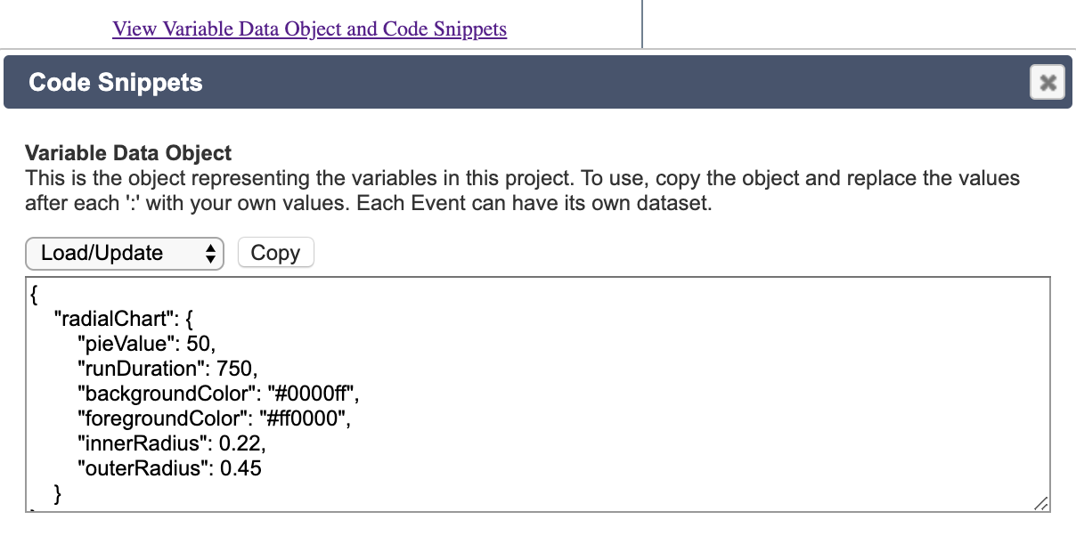
Updating Variables at Runtime
When variables or custom images are included in the Animator, an example
data object that is needed at runtime can be viewed and copied in both the
'Export Files' and 'Copy Source' options in the 'Load Image' section. Click
on the 'View Variable Data Object and Code Snippets' link to open
the dialog with that information.
The data object for custom images is combined with the standard variable
data object but the custom image values are stored in a sub-property named
after the Id of the custom image. In the example below, the sub-property is
'radialChart'.
Access Variable Data
Object
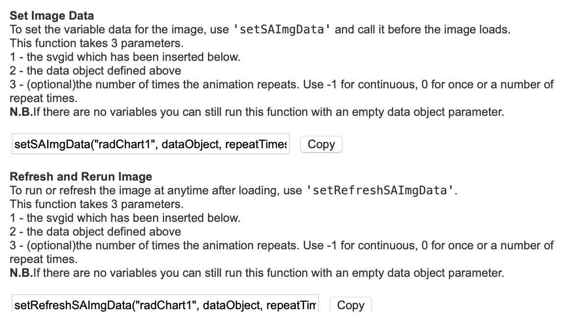
Further down the dialog are sample of the functions that can be called using
the Inovista Animator API. Functions such as setSAImgData and
setRefreshSAImgData can be used in conjunction with the data
object to set the variable values at runtime. The dialog contains function
outlines with the relevant svg Id, just add the data object and the
'repeatTimes' parameter.
