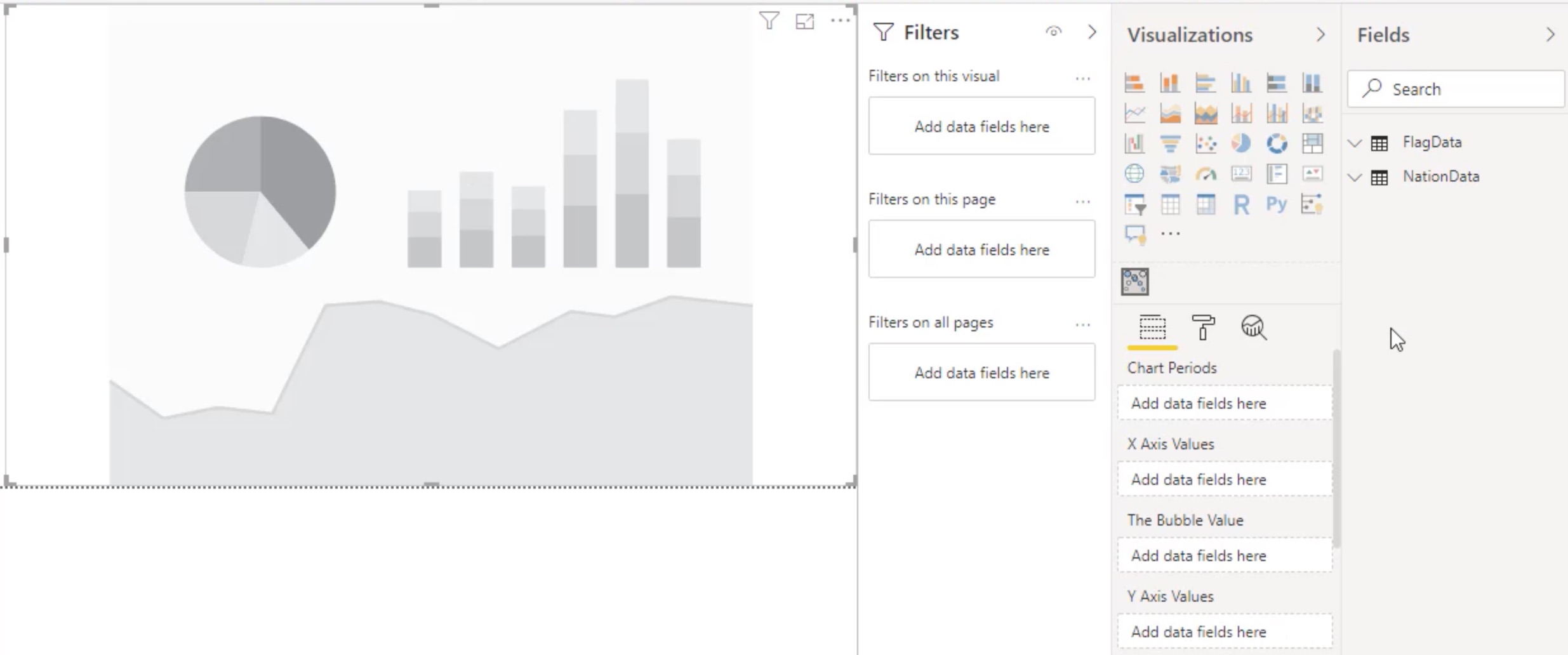
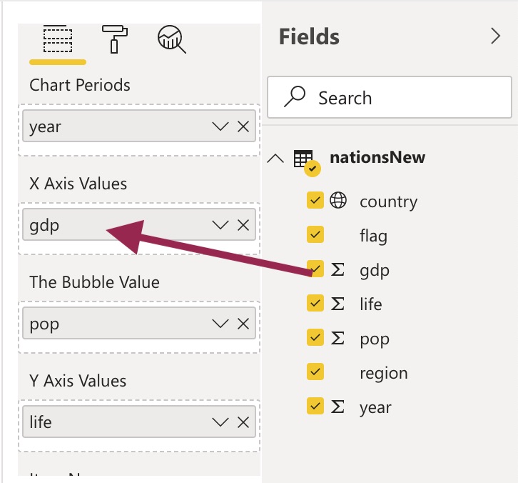
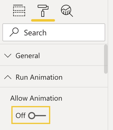
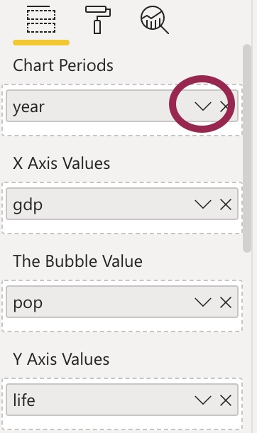
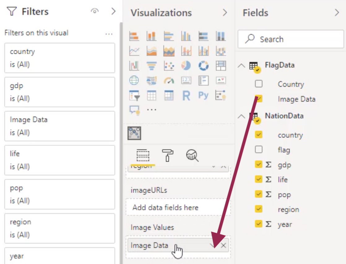
This Power BI custom visualization is based on the D3 implementation of the Gapminder 'Wealth and Health of Nations' animation. This visualization allows a designer to use either a bubble or an image to represent the core data points in the chart in addition to allowing a user to pause the animation and browse through the various data periods.
This custom visualization was generated by the Inovista Animator. A custom image is loaded into the Animator where additional animations can be added, the resultant image is then exported as a Power BI visual.


